Printing a Logo on Parchment Paper: Inks, Colors, Layouts and Artwork
By the team at The Parchment Paper ·
A printed parchment sheet turns a plain wrap into the first thing a customer sees when the bag opens. This guide covers the inks, the color choices, the layouts that work on a sheet and the artwork we need to print your logo cleanly.
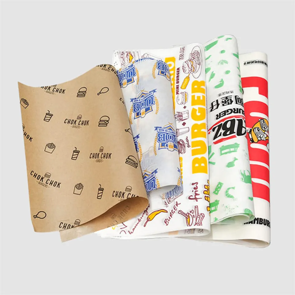
Need a price? Pick a parchment and a quantity; a written quote comes back within one business day.
Which inks print on parchment that touches food?
We print with food-safe soy and water-based inks. They go on the side of the sheet that faces away from the food. The printed face is the outside of a wrap or the underside of a basket liner.
Soy and water-based inks dry flat into the paper rather than sitting on top as a film. That is why a printed sheet still folds without the ink cracking at the crease.
The release coating stays on the food side. The ink does not change how the sheet behaves under a hot sandwich or a slice of pizza on the pass.
How many colors can a parchment logo have?
Jobs run in one to four colors, each matched to a Pantone solid-coated reference. Every color is a separate pass, so a two-color logo costs more than one color and a four-color logo more again.
Four spot colors is not the same as full-color photo printing. Gradients, photographs and soft shadows do not reproduce well on parchment, and we will say so at proof stage.
Most food logos look sharper reduced to one or two flat colors. Black on kraft and one brand color on white cover a large share of the wraps we print.
Count the colors in your logo before you ask for a price. A logo with a tint of the main color is still two inks, since a tint is screened from a separate pass.
Do you match Pantone colors on parchment?
Yes, send the Pantone solid-coated number and we mix to it. On bleached white stock the match is close, since the paper gives a neutral base.
On unbleached stock the kraft tone shows through the ink and shifts it warmer. A light blue reads gray on kraft and a pale yellow almost disappears.
For a tight brand color, print on white. For a kraft look, pick a dark ink and accept that the paper tints it. Color shift on unbleached within normal trade tolerance is not a misprint.
One color on unbleached or two colors on white?
The stock decides more than the ink does. Unbleached parchment is a kraft-tone sheet, and one dark color on it reads as a finished design. Two colors on kraft tend to look muddy, because the paper is already a color.
Bleached white parchment takes two, three or four colors cleanly. A logo with a brand red and a charcoal outline keeps both on white and loses the outline on kraft.
Here is how the two stocks compare for a printed job:
| Stock | Best ink count | Pantone accuracy | Hides grease marks | Typical use |
|---|---|---|---|---|
| Unbleached (natural kraft-tone) | One, at most two | Shifts warmer | Well | Deli wraps, bakery sheets, pouches |
| Bleached white | One to four | Close match | Less | Branded trays, pizza liners, retail wraps |
If you already use kraft bags or boxes, match them with one color on unbleached parchment paper for wraps. The wrap then ties to the rest of the packaging without a second ink.
Step-and-repeat, single centered logo or border?
Three layouts cover nearly every job, and the right one depends on how the sheet is used.
Step-and-repeat tiles the logo across the whole sheet in a grid or diagonal. It suits wraps, because however the sheet folds, part of a logo faces out. It is also the layout that forgives a slightly off-center fold.
A single centered logo suits a sheet that lies flat, such as a tray liner, a cake board cover or a liner under a burger in a basket. The mark sits in the middle and the food frames it.
A border runs the design along the edges and leaves the center plain. It works on a pouch where the fold hides the middle, and on a sheet that gets a sticker or a handwritten note in the center. The custom printed parchment paper sheets page shows each layout on a 12 by 16 sheet.
What file format should the logo be sent in?
Send a vector file. AI, EPS, SVG and a vector PDF all work, and any of them scales to a 24 inch sheet or a 2 inch repeat without going soft.
A PNG or JPG is a bitmap. At the size it was made for a website it prints fuzzy on paper, and the edges of letters break up. If vector is all you lack, a flat PNG at least 300 dpi at the printed size is the fallback.
Convert text to outlines before you send the file, or include the font. A missing font gets replaced on our side and the proof will not look like your brand.
How thin can lines and type be on parchment?
Parchment is absorbent, so very fine detail spreads a little as the ink dries. We ask for these minimums:
- Positive lines and strokes: about 0.5 pt, or they thin out and break on the repeat.
- Reversed-out lines, where the paper shows through a solid color: about 0.75 pt, since the ink closes in from both sides.
- Type: about 6 pt for positive text, 8 pt for reversed text, and no thin serif faces below 10 pt.
- Gaps between elements: at least 1 pt, so two shapes do not merge into a blot.
- Margin: keep the logo at least a quarter inch from the sheet edge, where cutting can vary by a hair.
A logo drawn for a storefront sign often has hairlines that look fine at 4 feet wide. Reduced to a 2 inch repeat on a wrap they vanish, so we thicken them at proof stage or ask you to.
What does the free design proof show?
Before anything prints you get a proof at no charge. It shows the logo placed on an outline of the exact sheet size, in the stock color you chose, with each ink named by Pantone number.
On a step-and-repeat it shows the spacing and the angle of the tiles. On a pouch it marks the fold line so you can see what faces out after folding. It also states which face carries the ink and which carries the release.
Check the proof on screen at full size, then look at it reduced to the size of a wrap in the hand. Edits at proof stage are unlimited, and nothing goes to press until you approve it in writing.
Read the Pantone numbers on the proof against your brand guide. If the proof names a close match rather than your exact number, say so and we re-set it before approval.
Common artwork mistakes on printed parchment
The same handful of problems hold up most jobs, and all of them are quick to fix before the proof:
- A screenshot or website PNG sent as the logo, too small to print clean.
- RGB or screen colors with no Pantone reference, so the ink has nothing to match.
- A pale ink chosen for kraft stock, where the paper swallows it.
- A gradient or drop shadow that cannot be made in flat spot colors.
- Text left as live fonts that we do not have.
- A logo pushed to the sheet edge with no margin for the cut.
- A repeat spaced so tightly that a fold lands on a logo every time.
- White ink expected on kraft without asking first, since white on unbleached is a special case to confirm on the quote.
How to order a printed parchment job
Start in the Design Your Parchment Paper studio, choose the sheet size, stock and layout, and upload the logo. Or email the file and the sizes to info@theparchmentpaper.com with the quantity.
We send a written quote within one business day and the proof follows. Minimum order is 1,000 sheets or pouches, production runs 4 to 6 business days after approval, and delivery is free and tracked to any US address.
Keep one approved proof on file. Repeat orders print from it without a new setup, and a color or layout change gets a fresh proof at no charge.
Parchment mentioned in this guide
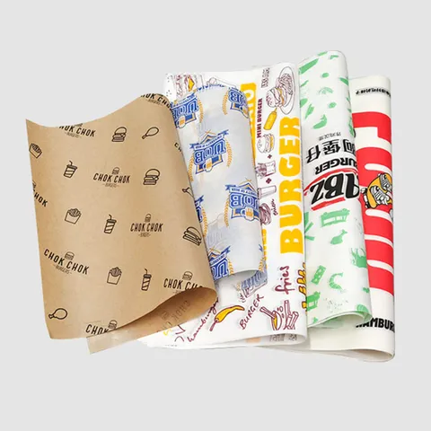 Custom Printed Parchment PaperYour logo or pattern, one to four colors, sheets or rollsfrom $0.30 a sheet
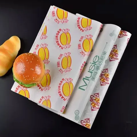 Branded Sandwich ParchmentPrinted wraps for sandwiches, burgers and basketsfrom $0.30 a sheet
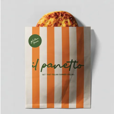 Parchment Cooking PouchesPre-folded pouches for fish, vegetables and bread, plain or printedfrom $0.30 a pouch
Questions about this guide
Which side of the parchment sheet does the logo print on?
The side that faces away from the food. On a wrap that is the outside of the fold, and on a liner it is the face against the basket or tray.
Are the inks used for parchment logos safe near food?
Yes, we print with food-safe soy and water-based inks. They dry into the paper on the non-food side and do not transfer through the sheet.
How many Pantone colors can one parchment logo use?
One to four, each a separate pass matched to a Pantone solid-coated reference. Photographs and gradients are not printable this way.
Why does my brand blue look dull when printed on kraft parchment?
The kraft tone shows through the ink and warms it. Print on bleached white for a close Pantone match, or choose a dark ink on kraft.
Is step-and-repeat or a single logo better for sandwich wraps?
Step-and-repeat, because part of a logo faces out however the wrap folds. A single centered logo suits flat liners and tray covers.
Can I send a JPG of my logo for printing on parchment?
A vector file is much better. A JPG prints fuzzy unless it is at least 300 dpi at the printed size, and a vector AI, EPS, SVG or PDF scales clean.
What is the thinnest line that prints cleanly on parchment?
About 0.5 pt for a positive line and about 0.75 pt reversed out of a solid. Thinner lines spread or break as the ink dries into the paper.
Does the parchment proof show the actual sheet size and fold?
Yes, the logo sits on an outline of the exact sheet size with inks named by Pantone number. Pouch proofs mark the fold line as well.
Does printing change which coating my parchment wrap needs?
Slightly, since two-sided silicone cannot carry ink. Printed jobs run on Quilon, unbleached or one-sided silicone, which the parchment coating comparison guide explains.
Can a printed parchment logo wrap be reordered from the old proof?
Yes, an approved proof stays on file and a repeat order prints from it. Any change to color or layout gets a new free proof first.
Something else? Ask us on WhatsApp or call (503) 461-4788.
Tell us what you bake or wrap
Send the parchment, a size and a quantity, plus a logo if you have one. We reply in writing within one business day with a price and a free design proof. Prefer to talk? Call (503) 461-4788 or message us on WhatsApp.